All data stories / Growth and wealth
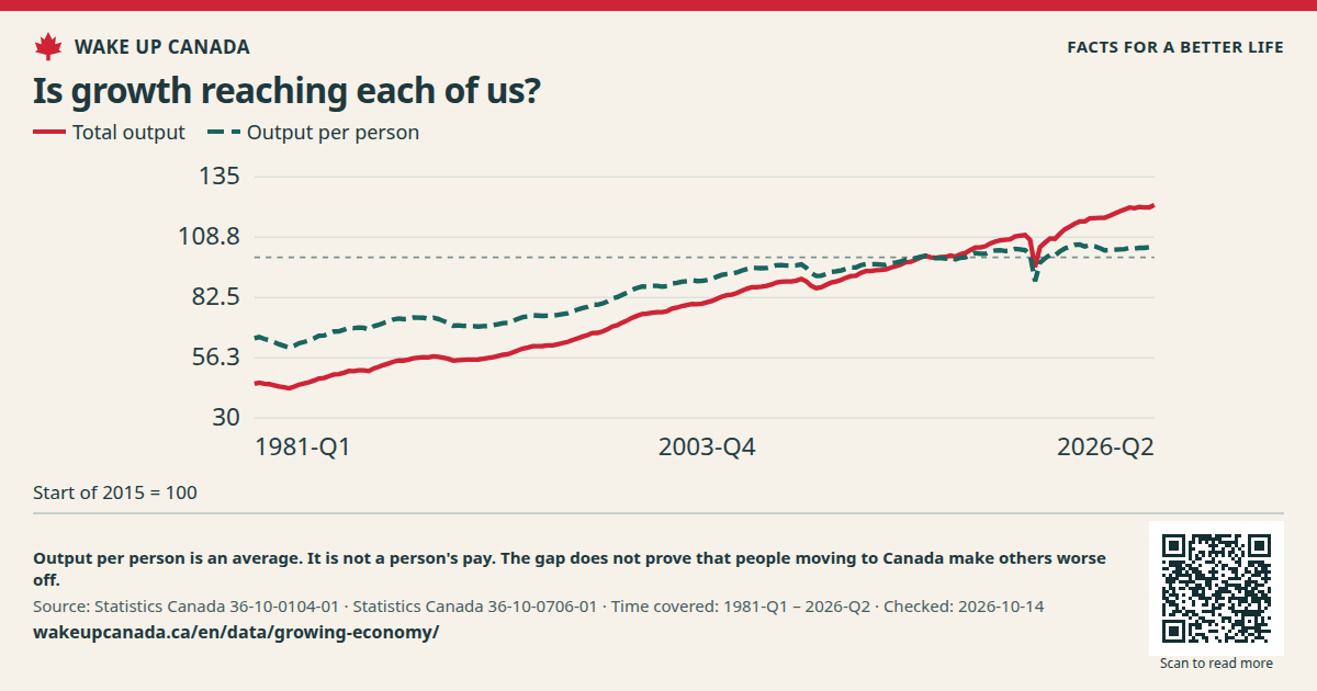
Is growth reaching each of us? Canada's economy is much bigger than in 1981. Gains per person have been slow in the past decade. Look past the total.
Total output and output per person, since 1981 Time covered: 1981 · Quarter 1 — 2026 · Quarter 2
Full history Past 20 years Past 10 years
Showing: 1981 · Quarter 1 — 2026 · Quarter 2
Total output
122.7 Last point · Start of 2015 = 100 Change over 10 years: +22.4% 2016 · Quarter 2 → 2026 · Quarter 2
Output per person
105.4 Last point · Start of 2015 = 100 Change over 10 years: +6.3% 2016 · Quarter 2 → 2026 · Quarter 2
Total output 122.7 Output per person 105.4 130 107.5 85 62.5 40
1981 · Quarter 1 2026 · Quarter 2
Start of 2015 = 100
Two lines show output and output per person from 1981. Both use early 2015 as 100. Price rises have been taken out.
Checked: Oct 14, 2026
See all the data This table has the same values as the chart. You can scroll the table sideways.
Download the data (CSV) ↓ Why this matters More people can mean more total output. We also need tools, homes and skills that help each person do well. A bigger total is not enough.
What we want to change Let people build useful homes and firms. Open markets and help proven skills count.
What this does not show Output per person is an average. It is not a person's pay. The gap does not prove that people moving to Canada make others worse off.
Read this fairly Output per person has risen a lot since 1981. The concern is slow recent gains, not a fall across the whole period. This chart alone cannot tell us which rule caused a change.
How we made this chart GDP counts goods and services made in Canada. These lines take out price rises. We divide each value by its own value in the first three months of 2015, then multiply by 100. The shared history starts in 1981.